
In the vibrant world of graphic design, color holds immense power. It has the ability to evoke emotions, convey messages, and create a lasting impact on the viewer. From bold and energetic hues to subtle and calming tones, every color choice in graphic design is a deliberate decision that can significantly influence audience perception and response.
In this article, we will delve into the fascinating realm of color psychology and explore the profound impact of color in graphic design.
Unveiling the Emotive Language of Colors
Colors possess their own unique language, capable of evoking specific emotions and associations. Understanding color psychology allows graphic designers to effectively communicate and connect with their target audience.
Here are a few key color associations:
Red: A color of passion, energy, and urgency, often used to grab attention and create a sense of excitement. It can also signify love, power, or danger.

Blue: Associated with trust, stability, and tranquility, blue is frequently employed to convey reliability and professionalism. Lighter shades can evoke a sense of calmness, while darker blues exude authority.

Yellow: A vibrant color symbolizing joy, happiness, and optimism. It can be attention-grabbing and is often used to convey a sense of cheerfulness and positivity.

Green: Reflecting nature, growth, and harmony, green is often used to represent health, eco-friendliness, and freshness. It can also convey balance and tranquility.

Purple: A color that represents creativity, luxury, and spirituality. Purple is frequently employed to evoke a sense of elegance, sophistication, and imagination.

Orange: A warm and energetic color associated with enthusiasm, excitement, and friendliness. It can create a sense of urgency and can be used to stimulate impulse buying.

Black: Symbolizing sophistication, power, and elegance, black is often used to create a sense of luxury or exclusivity. It can also convey a sense of mystery or formality.

White: Purity, simplicity, and cleanliness, white holds a versatile role in graphic design. It is commonly used as a background color to create a sense of spaciousness and highlight other elements.

Pink: Femininity, romance, and playfulness, pink can create a soft and delicate aesthetic. It is commonly used in designs targeting young girls, beauty, and fashion industries.

Brown: Symbolizing earthiness, stability, and warmth, brown is frequently used to convey a sense of reliability, authenticity, and organic elements. It is commonly seen in designs related to natural products, outdoor activities, and rustic themes.

Gray: A neutral color that represents practicality, stability, and sophistication. Gray is often used as a backdrop to highlight other colors or to create a sleek and minimalist design aesthetic.

Gold: Associated with luxury, wealth, and prestige, gold is often used to convey elegance and exclusivity. It adds a touch of glamour and opulence to designs, particularly in high-end industries such as jewelry and luxury goods.

Silver: Symbolizing modernity, sleekness, and innovation, silver is frequently used in designs related to technology, futuristic concepts, and modern aesthetics. It can add a cool and sophisticated touch.

Balancing the Visual Composition
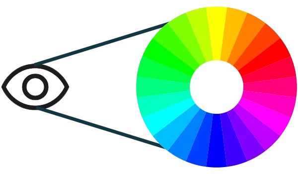
In graphic design, color harmony and contrast play vital roles in creating aesthetically pleasing and visually balanced compositions. Color harmony refers to the combination of colors that work well together, while contrast involves utilizing colors that are distinctly different to create emphasis and visual interest.
Designers often employ color schemes such as complementary, analogous, or monochromatic to achieve harmony or contrast. Complementary colors, located opposite each other on the color wheel, create a striking contrast when used together. Analogous colors, which sit next to each other on the wheel, offer a harmonious and cohesive look. Monochromatic schemes, built around variations of a single color, can create a sense of elegance and simplicity.
The Subtle Language of Identity
Color is an integral part of branding, as it helps create a distinctive identity and fosters brand recognition. Consistent color usage across various brand touchpoints, such as logos, websites, packaging, and marketing materials, helps establish a strong visual identity.
Well-known brands leverage color to evoke specific emotions and associations. For example, the cheerful yellow of McDonald’s logo reflects the brand’s friendly and vibrant personality, while the calm blue of Facebook fosters trust and reliability.
The Importance of Cultural Context
It is essential to consider cultural context when choosing colors for global or diverse audiences. Colors can hold different meanings and symbolism across cultures. For instance, while white signifies purity and innocence in Western cultures, it represents mourning in some Eastern cultures.
Conclusion:
Color is a powerful tool in graphic design, capable of shaping perceptions, emotions, and brand identities. By understanding the psychology behind colors, designers can effectively communicate messages, evoke desired responses.
Get to know the Importance of Storyboarding by clicking here.