
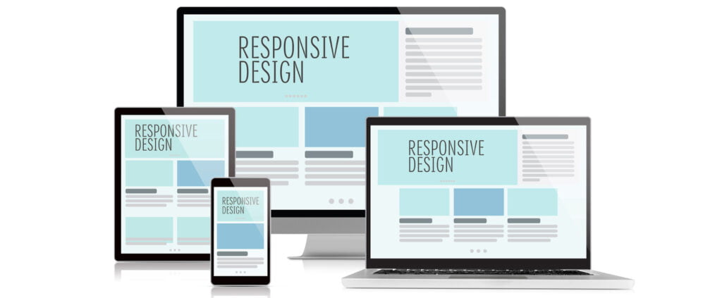
In the digital age, creating a seamless user experience across all devices is paramount. Just as water adapts to the shape of any container, fluid layouts in responsive web design ensure your website looks and functions beautifully on any screen size. Let’s dive into the world of fluid layouts and explore how they can transform your web presence.

What Are Fluid Layouts?
Fluid layouts, also known as liquid layouts, use relative units like percentages instead of fixed units like pixels. This design approach allows web elements to resize and reposition themselves based on the size of the user’s screen. The result is a website that maintains its aesthetics and functionality, whether viewed on a large desktop monitor or a small smartphone screen.
Benefits of Fluid Layouts
Enhanced User Experience
Consistency: Users enjoy a consistent experience across devices, reducing frustration and increasing satisfaction.
Accessibility: Fluid layouts make it easier for users with different devices and screen sizes to access and navigate your site.
Future-Proofing
Adaptability: As new devices with varying screen sizes emerge, fluid layouts ensure your website remains accessible and visually appealing.
Scalability: Fluid designs can easily scale with changes, minimizing the need for constant redesigns.
SEO Benefits
Improved Rankings: Search engines favor websites that offer a good user experience across all devices, potentially boosting your search engine rankings.
Reduced Bounce Rates: By providing a seamless experience, fluid layouts help keep visitors engaged, reducing bounce rates and increasing the likelihood of conversions.
Implementing Fluid Layouts: Best Practices
Use Relative Units
Percentages and Ems: Utilize percentages for widths and ems for font sizes to create scalable elements that adjust smoothly to screen sizes.
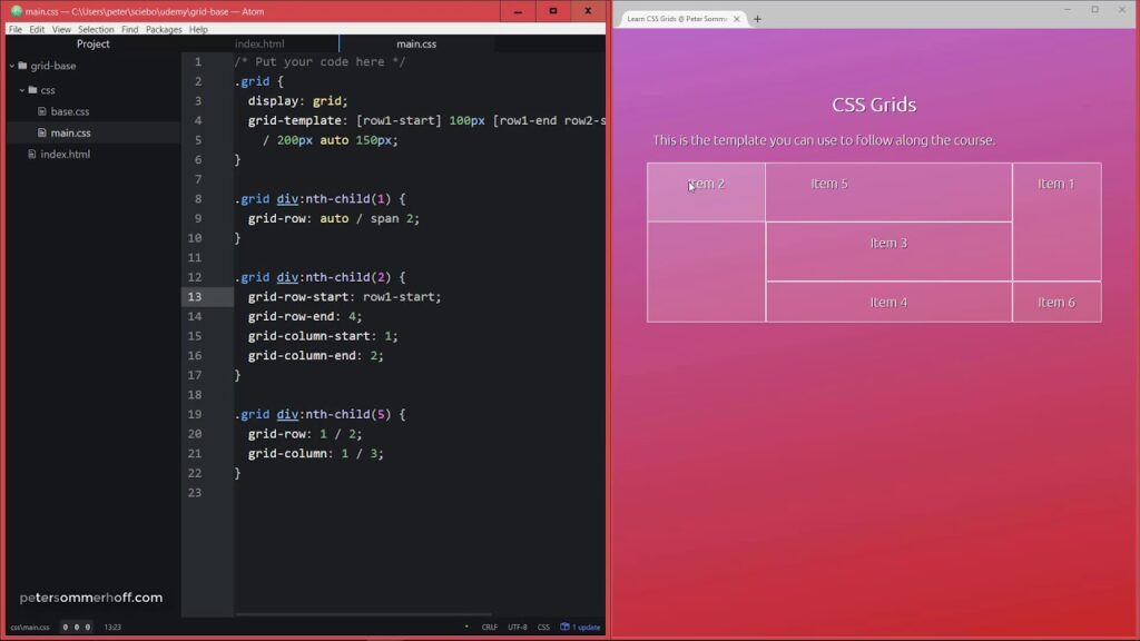
Flexible Grid Systems
CSS Grid and Flexbox: Leverage modern CSS techniques like Grid and Flexbox to build flexible and responsive grid systems that adapt to different screen sizes.
Responsive Images
Adaptive Media: Use responsive image techniques such as the <picture> element and srcset attribute to serve appropriately sized images for different devices.
Media Queries
Breakpoints: Implement media queries to apply different styles at various screen widths, ensuring your design adapts fluidly to any screen size.
Testing and Optimization
Cross-Device Testing: Regularly test your website on multiple devices and screen sizes to identify and fix any layout issues.
Performance Optimization: Ensure your fluid layout does not compromise site performance by optimizing images, minifying CSS and JavaScript, and using efficient coding practices.
Case Study: Successful Fluid Layout Implementation
To illustrate the impact of fluid layouts, let’s look at a real-world example. Vape Depot revamped their website using a fluid layout approach. The result? A 25% increase in mobile traffic, a 15% decrease in bounce rates, and significantly higher user satisfaction. By embracing fluid layouts, vapedepotusa.com ensured their site was accessible and engaging across all devices, leading to improved overall performance and customer engagement.
Conclusion
Fluid layouts are a vital component of modern web design, providing a flexible, adaptable, and user-friendly experience across all devices. By embracing this approach, you not only enhance your website’s usability but also future-proof your digital presence. At Digital Echoes, we specialize in creating fluid, responsive web designs that cater to the ever-evolving digital landscape. Ready to make your site flow seamlessly across all screens? Let’s dive in together!
Feel free to reach out for a consultation. Together, we can create a web that’s as adaptable and dynamic as the users it serves.